⭐ Sections
Product tabs
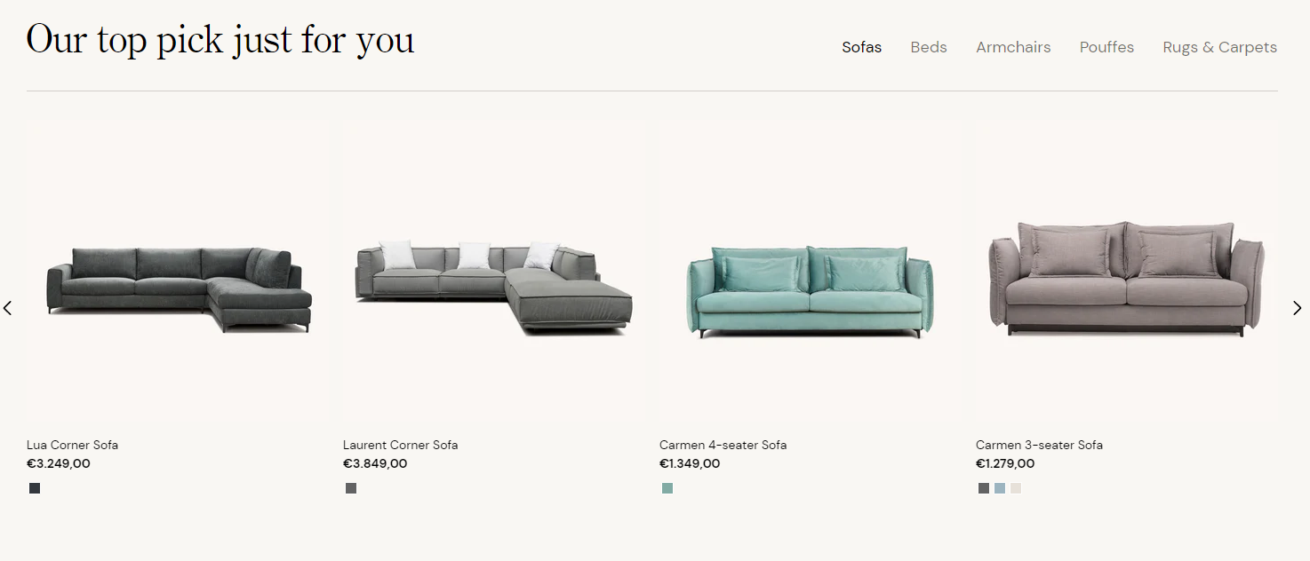
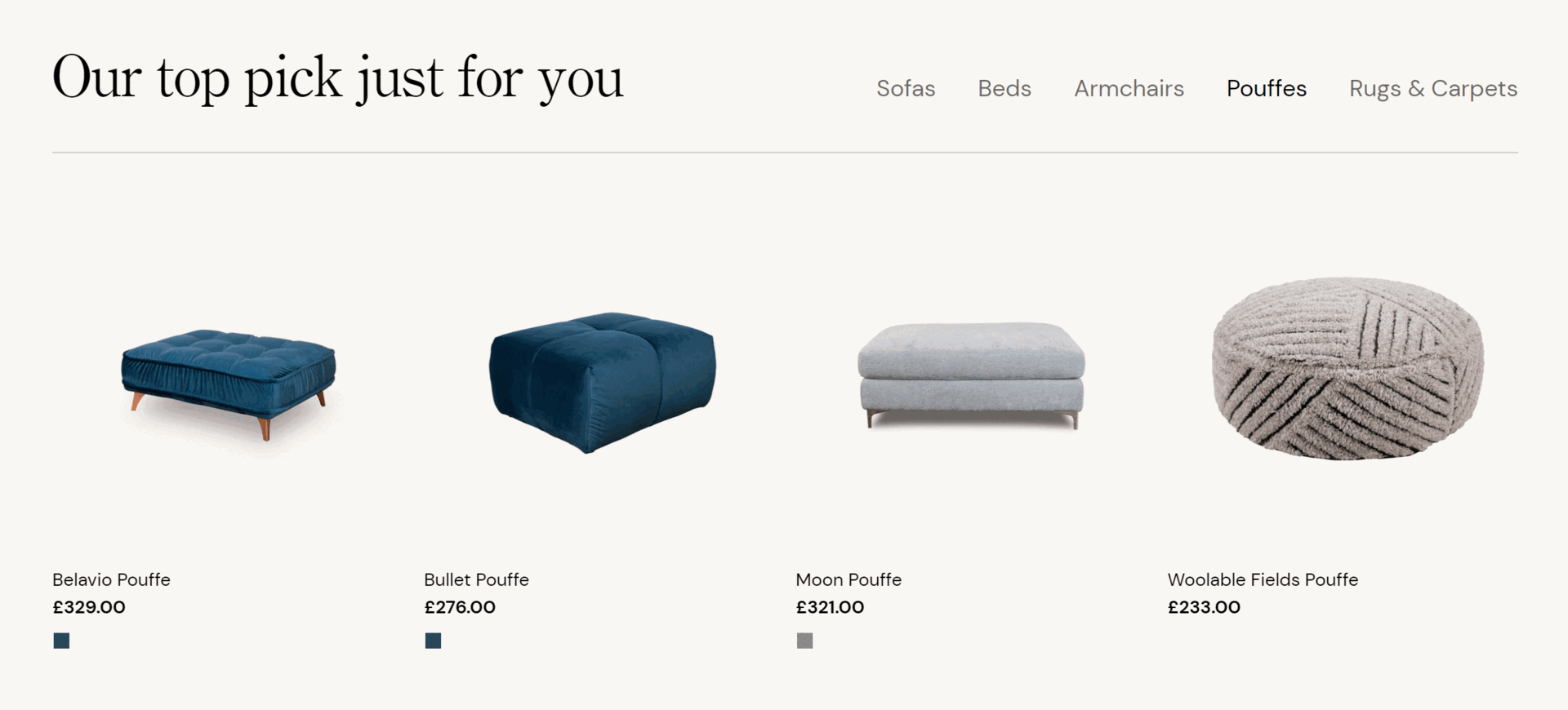
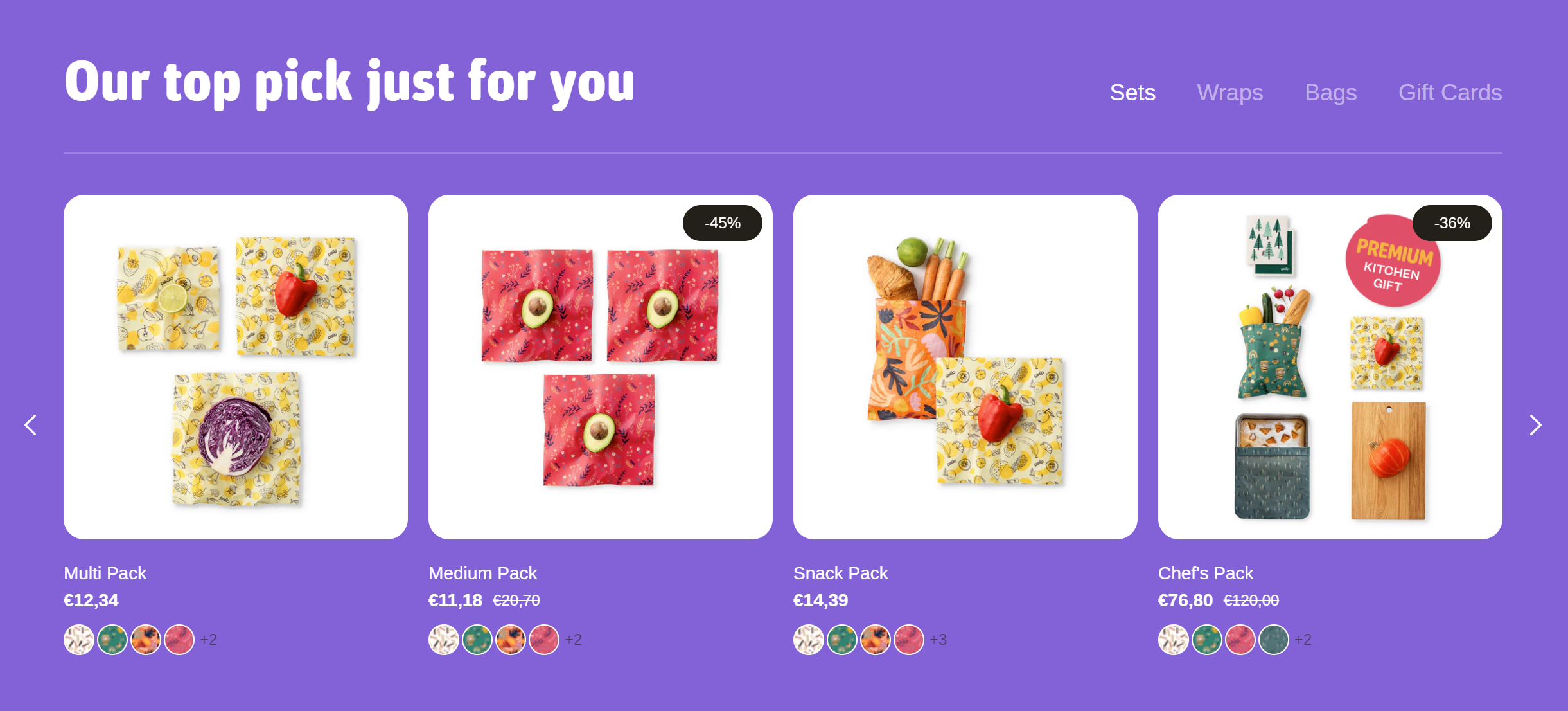
Organize product information into tabs, such as description, specifications, and reviews. This keeps your product pages clean and easy to navigate, providing a better shopping experience.
Adjust product tabs section
These settings allow you to customize the appearance and layout of the product tabs section, ensuring it fits seamlessly within your store’s design and effectively showcases product information in a tabbed format.
Within the Product tabs settings, the following fields can be adjusted:
Heading
- Enter a title for the product tabs section. This heading will be displayed above the tabs. For example, "Product tabs heading".
Background color
- Select a background color for the product tabs section. This helps ensure the section matches your store's overall design.
Text theme
- Choose the theme for the text color. Options include:
- Dark: Dark text on a light background.
- Light: Light text on a dark background.
Section padding
Top padding: Adjust the space at the top of the product tabs section. Measured in pixels (px), this allows you to control the vertical spacing above the section for better layout and design consistency.
Bottom padding: Adjust the space at the bottom of the product tabs section. Measured in pixels (px), this allows you to control the vertical spacing below the section for better layout and design consistency.
Custom CSS
- Add custom CSS to further style and customize the newsletter signup section according to your specific design needs and preferences.
Available blocks
Tab
Within the Tab, the following fields are available:
Collection
- Select collection: Click this button to choose a product collection that will be displayed in this tab. This determines which products are shown within the tab.
Tip
Maximum number of products in tab: 20 <br>
Maximum number of tabs: 5
Heading
- Enter a title for the product tab. This heading will be displayed at the top of the tab content. For example, "Bags".
Show vendor
- Check this box to display the vendor's name for each product within the tab. This helps customers identify the brand or supplier of the products.
Show stock state
- Check this box to display the stock status of each product, indicating whether a product is in stock, out of stock, or available for pre-order.
Show second image on hover
- Check this box to enable the display of a second product image when customers hover over a product within the tab. This feature provides additional visual information about the product, enhancing the shopping experience.
Tip
You can use drag and drop to move individual blocks. In Shopify, individual blocks can be removed (bin) or hidden (eye), and then revealed again.