⭐ Sections
Navigation tabs
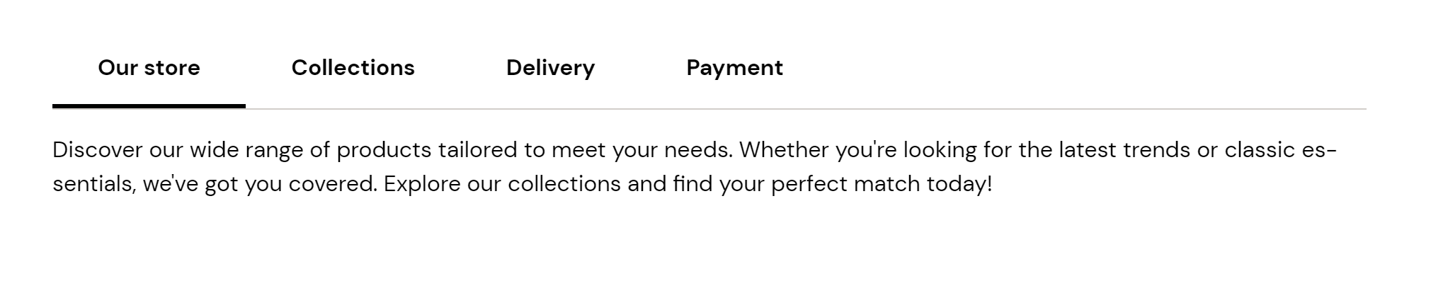
Create a tabbed navigation section, allowing customers to switch between different content panels without leaving the page. Useful for organizing detailed information or multiple product categories.
Adjust Navigation tabs section
These settings allow you to customize the appearance and layout of the navigation tabs section, ensuring it fits seamlessly within your store’s design and effectively organizes content for easy navigation by your customers.
Within the Navigation tabs settings, you can adjust the following fields:
Section padding
Top padding: Adjust the space at the top of the navigation tabs section. Measured in pixels (px), this allows you to control the vertical spacing above the section for better layout and design consistency.
Bottom padding: Adjust the space at the bottom of the navigation tabs section. Measured in pixels (px), this allows you to control the vertical spacing below the section for better layout and design consistency.
Custom CSS
- Add custom CSS to further style and customize the navigation tabs section according to your specific design needs and preferences.
Available blocks
Tab
Within the Tab, the following fields are available:
Heading
- Enter a title for the navigation tab. This heading will be displayed at the top of the tab, providing a label for the content contained within the tab.
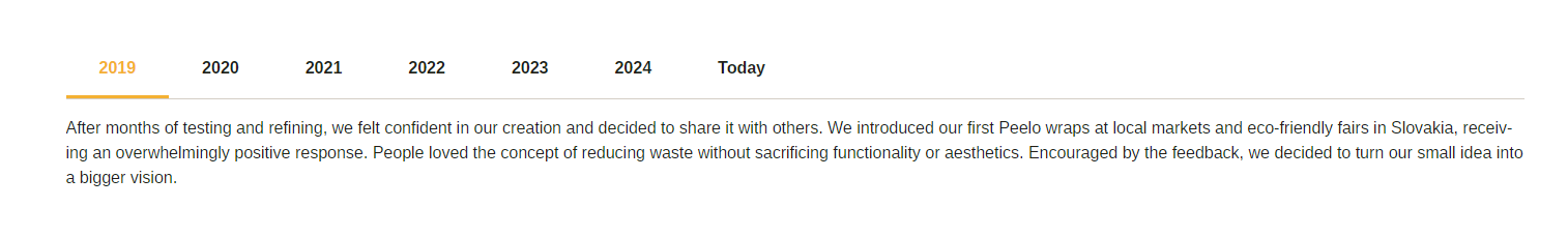
Content
- Provide the main text content for the navigation tab. Use the text editor tools to format the text, including bold, italic, lists, and links. This is where you provide detailed information or a message that will be displayed when this tab is active.
Tip
You can use drag and drop to move individual blocks. In Shopify, individual blocks can be removed (bin) or hidden (eye), and then revealed again.