⭐ Sections
Multicolumn
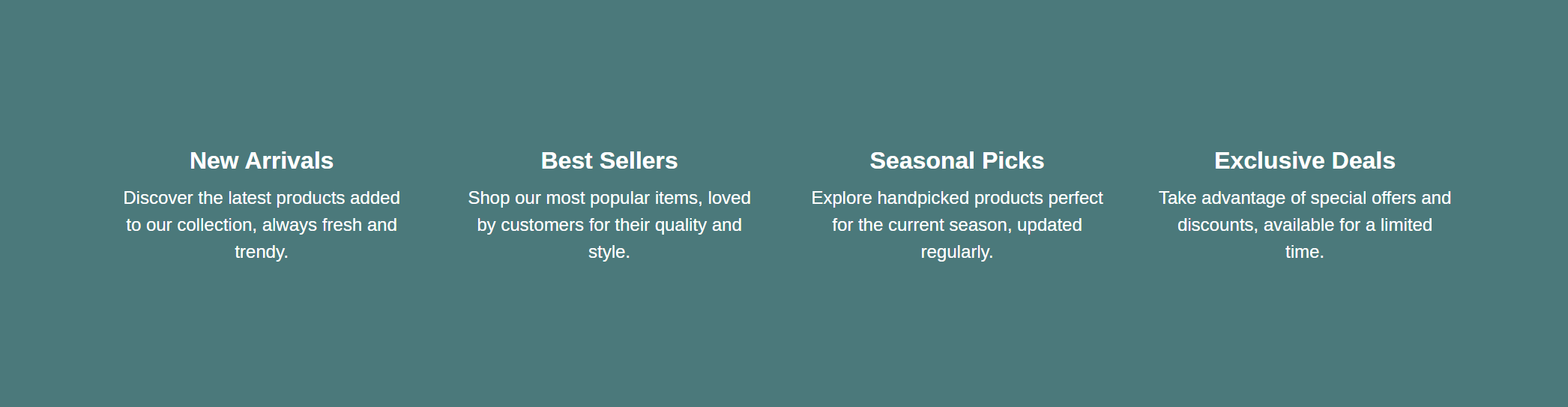
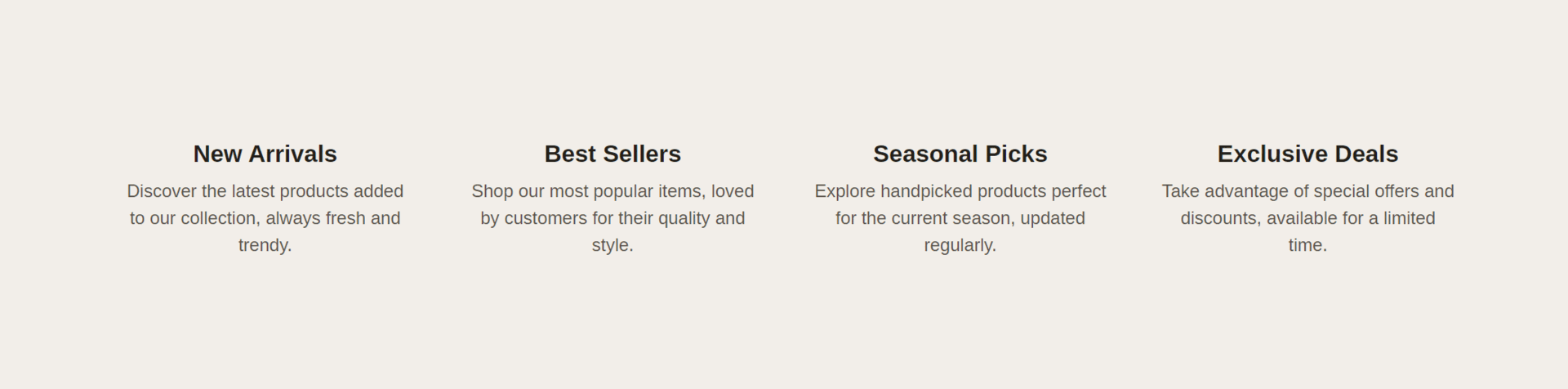
Present content in multiple columns, perfect for displaying a variety of information side by side, such as features, benefits, or categories. Enhances readability and organization.
Adjust Multicolumn section
These settings allow you to customize the appearance and layout of the multicolumn section, ensuring it fits seamlessly within your store’s design and effectively showcases the content in a structured and visually appealing manner.
Within the Multicolumn settings, you can adjust the following fields:
Number of columns on desktop
- Adjust the slider to set the number of columns for displaying content on desktop devices. This determines how many columns are shown side by side in a row.
Background color
- Select a background color for the multicolumn section. This helps ensure the section matches your store's overall design. The color code is displayed (e.g., #FFFFFF).
Text theme
- Choose the theme for the text color. Options include:
- Dark: Dark text on a light background.
- Light: Light text on a dark background.
Section padding
Top padding: Adjust the space at the top of the multicolumn section. Measured in pixels (px), this allows you to control the vertical spacing above the section for better layout and design consistency.
Bottom padding: Adjust the space at the bottom of the multicolumn section. Measured in pixels (px), this allows you to control the vertical spacing below the section for better layout and design consistency.
Custom CSS
- Add custom CSS to further style and customize the multicolumn section according to your specific design needs and preferences.
Available blocks
Column
Within the Column, the following fields are available:
Image
- Select image: Click here to upload or select an image for the column.
- Explore free images: Browse and select from free images available for use in the column.
Heading
- Enter a title for the column. This heading will be displayed at the top of the column, providing a title for the content.
Content
- Provide the main text content for the column. Use the text editor tools to format the text, including bold, italic, lists, and links. This is where you provide detailed information or a message related to the image and heading.
Tip
You can use drag and drop to move individual blocks. In Shopify, individual blocks can be removed (bin) or hidden (eye), and then revealed again.