⭐ Sections
Information cards
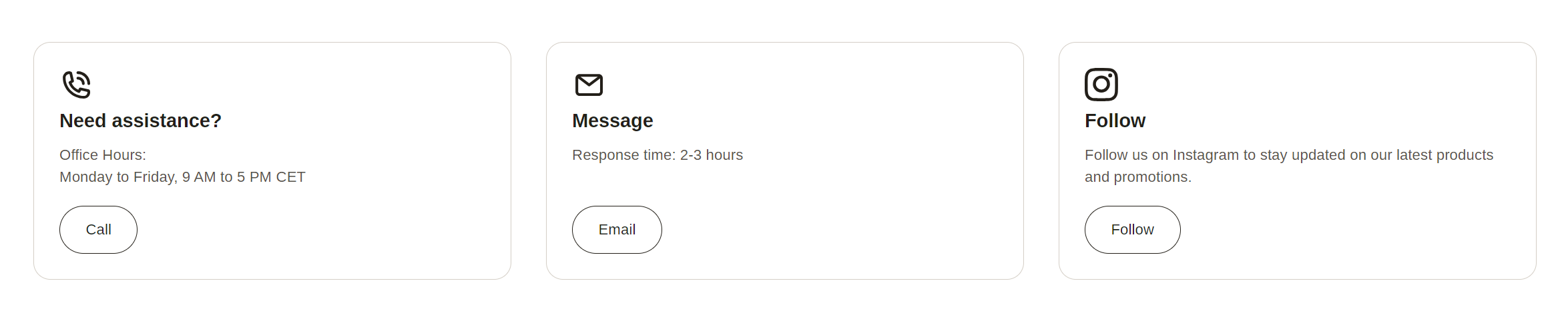
Display multiple cards, each containing an image, heading, text, and an optional button. Useful for showcasing features, services, or categories in a concise and visually appealing manner.
Adjust Information cards section
These settings allow you to customize the appearance and layout of the information cards section, ensuring it fits seamlessly within your store’s design and effectively presents key information to your customers.
Within the Information cards settings, you can adjust the following fields:
Heading
- Enter a title for the information cards section. This heading will be displayed at the top of the section.
Heading size
- Choose the size of the heading. Options include:
- Small: Small-sized heading.
- Medium: Medium-sized heading.
- Large: Large-sized heading.
Heading alignment
- Set the alignment of the heading. Options include:
- Left: Align the heading to the left.
- Center: Center the heading.
- Right: Align the heading to the right.
Section padding
Top padding: Adjust the space at the top of the information cards section. Measured in pixels (px), this allows you to control the vertical spacing above the section for better layout and design consistency.
Bottom padding: Adjust the space at the bottom of the information cards section. Measured in pixels (px), this allows you to control the vertical spacing below the section for better layout and design consistency.
Custom CSS
- Add custom CSS to further style and customize the information cards section according to your specific design needs and preferences.
Available blocks
Information card
Within the Information card, the following fields are available:
Icon
- You can choose from a variety of icons from different categories, including contact icons (e.g., phone call, email), store-related icons (e.g., award, cart, gift), and social media icons (e.g., Facebook, X, etc.). These icons will visually represent the benefit if no image is uploaded.
Heading
Enter a title for the information card. This heading will be displayed at the top of the card.
Content
- Provide the main text content for the information card. Use the text editor tools to format the text, including bold, italic, lists, and links. This is where you provide detailed information or a message.
Button label
- Enter the text for the button displayed on the information card. If you leave this field blank, the button will be hidden.
Button link
- Set the URL or page the button will link to. You can paste a link or search for a specific page within your store.
- Open link in new window: Check this box if you want the link to open in a new browser window or tab.
Tip
You can use drag and drop to move individual blocks. In Shopify, individual blocks can be removed (bin) or hidden (eye), and then revealed again.