⭐ Sections
Image banner
An eye-catching section to display a large, high-quality image with optional overlay text and a call-to-action button. Great for highlighting promotions, new products, or any important announcements.

Adjust Image banner
These settings allow you to create a visually appealing and effective image banner that can enhance your store's homepage or other key pages by showcasing important content, promotions, or announcements.
Within the Image banner settings, you can adjust the following fields:
Full width
- Check this box to expand the image banner to the full width of the screen.
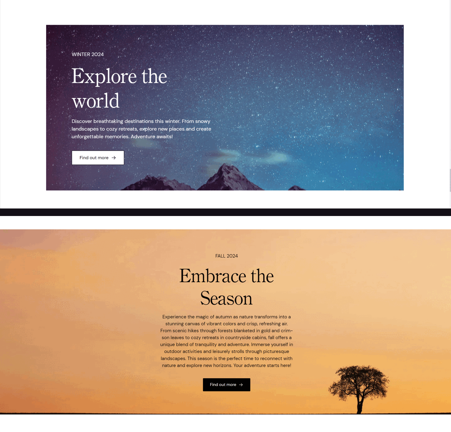
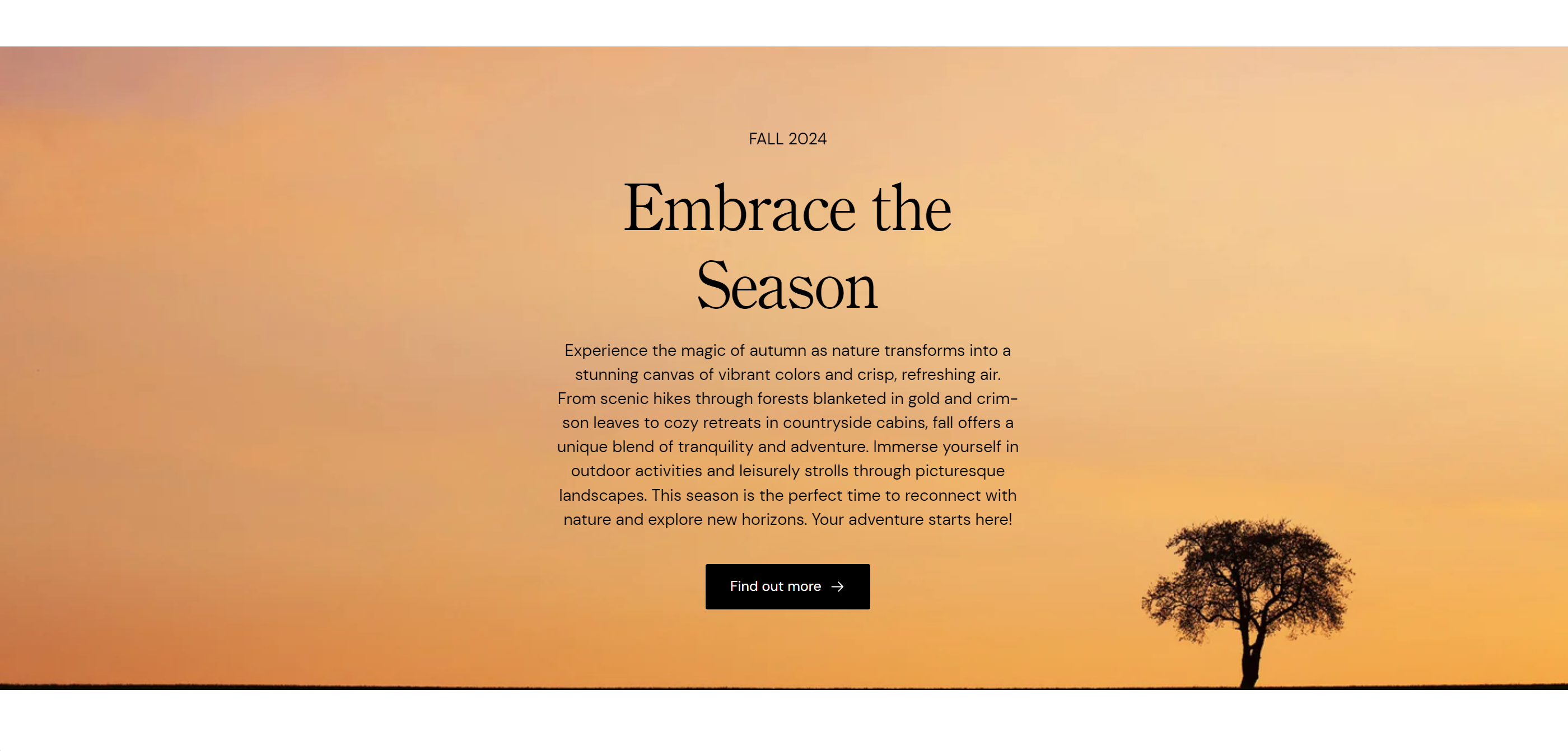
Example:
- Full width, Dark Text theme, Center Content alignment:

Image
Select image: Click here to upload or select an image for the banner.
Explore free images: Browse and select from free images available for use in the banner.
Image overlay opacity
- Adjust the slider to set the opacity level of the overlay on the banner image. This can enhance text readability by darkening or lightening the image background.
Text theme
- Choose the theme for the text color. Options include:
- Dark: Dark text on a light background.
- Light: Light text on a dark background.
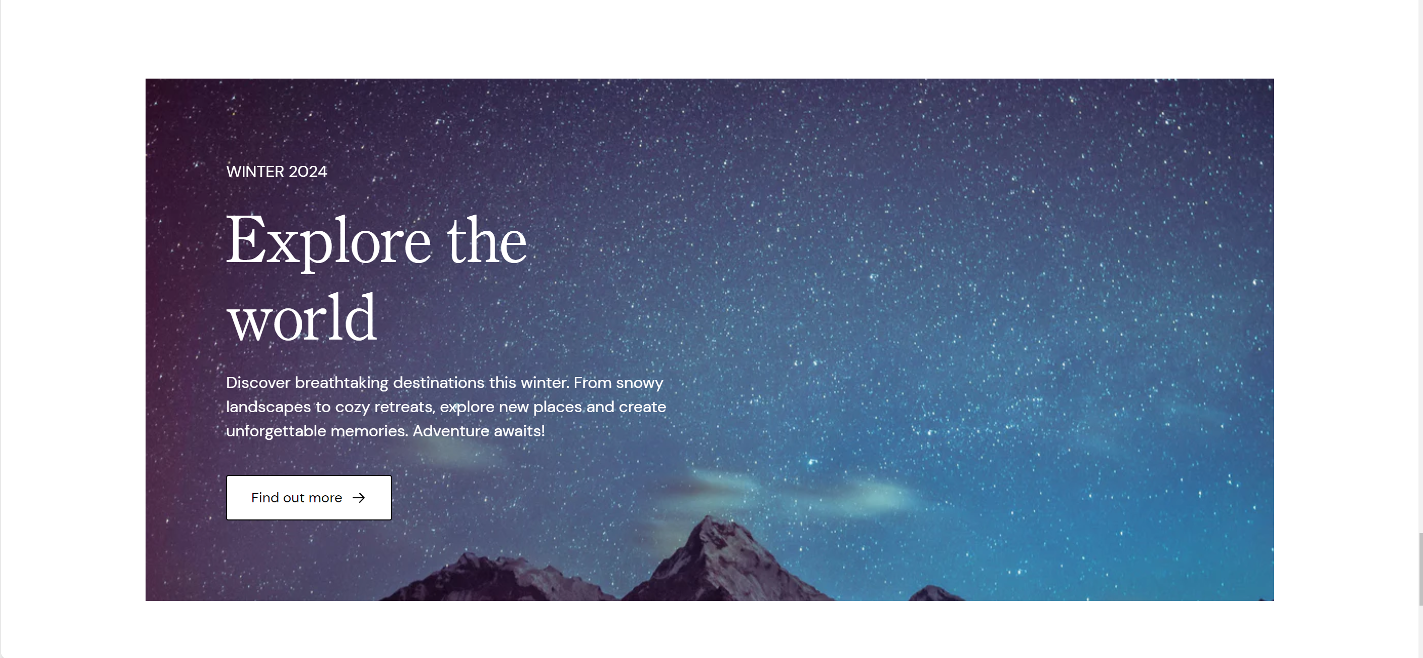
Example:
- Light Text theme, Left Content alignment, No full width

Desktop content alignment
Set the alignment of the content on desktop displays. Options include:
- Left: Align content to the left.
- Center: Center the content.
- Right: Align content to the right.
Subheading
- Enter a subheading to be displayed on the banner. This can provide additional context or information.
Heading
- Enter the main heading for the banner. This is typically the most prominent text on the banner.
Content
- Provide detailed content or description for the banner. Use the text editor tools to format the text, including bold, italic, lists, and links.
Button label
- Enter the text for the button displayed on the banner. If left blank, the button will be hidden.
Button link
Set the URL or page the button will link to. You can paste a link or search for a specific page within your store.
Open link in new window: Check this box if you want the link to open in a new browser window or tab.
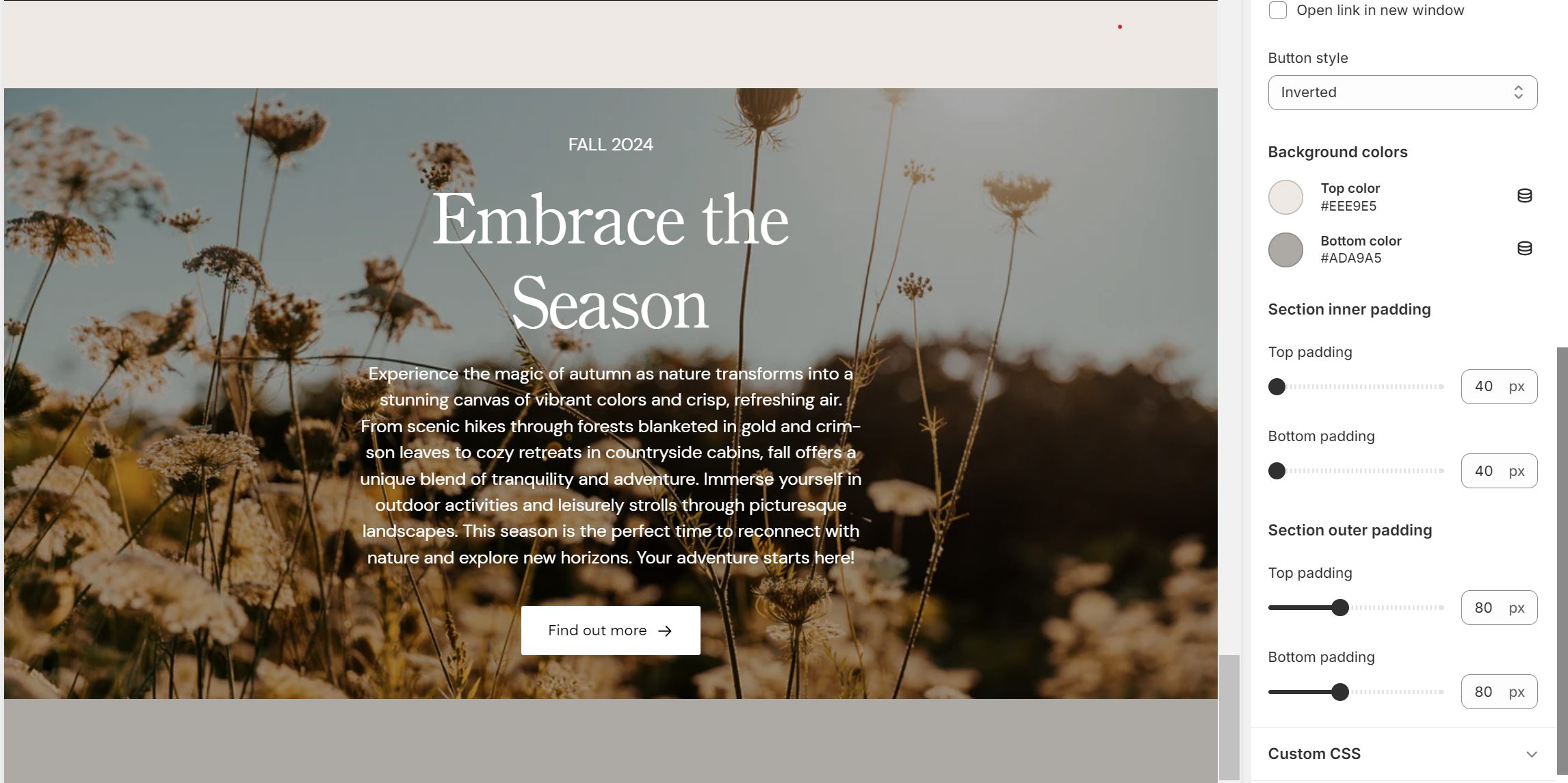
Button style
Choose the style for the button. Options might include:
- Default
- Inverted
- Outline
- Primary
Background colors
If these 2 colors are different, we recommend having the same value set for the top and bottom padding:
Top color: Select the top gradient color for the banner background.
Bottom color: Select the bottom gradient color for the banner background

Section inner padding
Top padding: Adjust the space at the top inside the banner section. Measured in pixels (px).
Bottom padding: Adjust the space at the bottom inside the banner section. Measured in pixels (px).
Section outer padding
Top padding: Adjust the space above the entire banner section. Measured in pixels (px).
Bottom padding: Adjust the space below the entire banner section. Measured in pixels (px). Top and bottom iner padding
Custom CSS
- Add custom CSS to further style and customize the newsletter signup section according to your specific design needs and preferences.