⭐ Sections
Contact form
The Contact form allows customers to reach out to you directly through the website. This form is essential for providing customer support, answering inquiries, and building trust with your audience. By filling out the contact form, customers can send messages, ask questions, or provide feedback, which you can then respond to promptly.
Adjust Contact Form
Within the Contact form settings, you can adjust the following fields:
Heading
- Enter a title for the contact form section. This heading will be displayed above the form, for example, "Contact Us".
Background color
- Choose the background color for the contact form section. Options include "Light" and "Light Surface" to match your store's design.
Form heading
- Enter a heading for the contact form itself. This text will appear at the top of the form. You can format the heading using bold, italic, and hyperlinks.
Form subheading
- Enter a subheading for the contact form to provide additional context or instructions. This can also be formatted with bold, italic, and hyperlinks.
Contact form padding
- Top padding: Adjust the space above the contact form to ensure proper spacing and alignment with other elements on the page. This is measured in pixels (px).
- Bottom padding: Adjust the space below the contact form for consistent spacing and design harmony. This is also measured in pixels (px).
Section padding
Top padding: Adjust the space above the entire contact form section to ensure proper spacing and alignment with other sections on the page. This is measured in pixels (px).
Bottom padding: Adjust the space below the entire contact form section for consistent spacing and design harmony. This is also measured in pixels (px).
Tip
These customization options allow you to tailor the contact form to fit seamlessly into your store’s design while providing a user-friendly way for customers to get in touch with you.
Custom CSS
- Add custom CSS to further style and customize the newsletter signup section according to your specific design needs and preferences.
Available Blocks
The customization options allow you to create informative and engaging cards that can highlight key information, promotions, or calls to action on your Shopify store, providing a more interactive and user-friendly experience for your customers.
Within the Contact form, the following blocks are available:
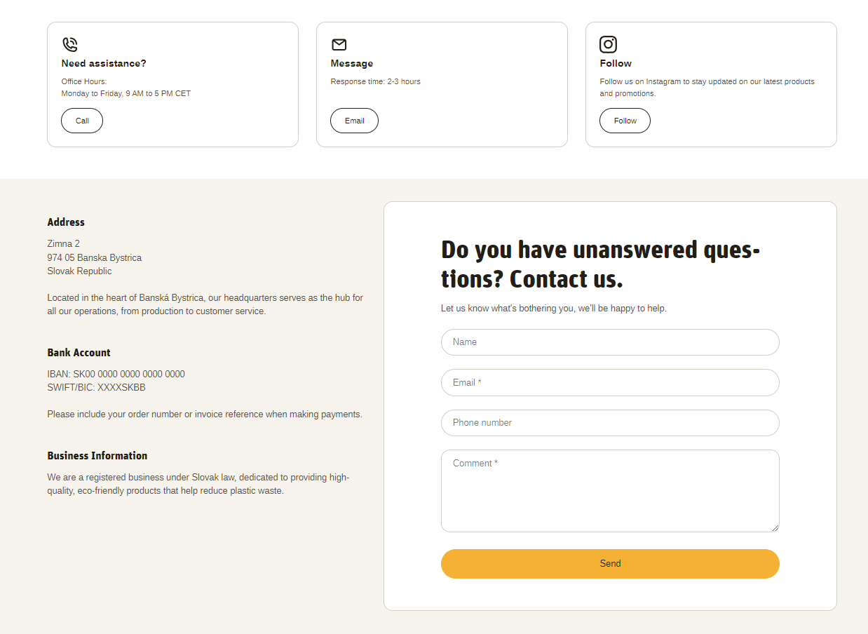
Information Card
Within the Information card the following fields are available:
Icon
- You can choose from a variety of icons from different categories, including contact icons (e.g., phone call, email), store-related icons (e.g., award, cart, gift), and social media icons (e.g., Facebook, X, etc.).
Heading
- Enter a title for the information card. This heading will be displayed at the top of the card, for example, "Information Card".
Content
- Provide the main text content for the information card. This can include descriptions, details, or any relevant information you want to convey. You can format the text using bold, italic, links, and various list options to enhance readability and emphasis.
Button label
- Enter the text for the button displayed on the information card. If you leave this field blank, the button will be hidden. For example, "Learn More" or "Shop Now".
Button link
Paste the URL or search for the link that the button will lead to when clicked. This can be an internal link to another page on your site or an external link to another website.
Open link in new window: Check this box if you want the link to open in a new browser window or tab when clicked.
Contact Information
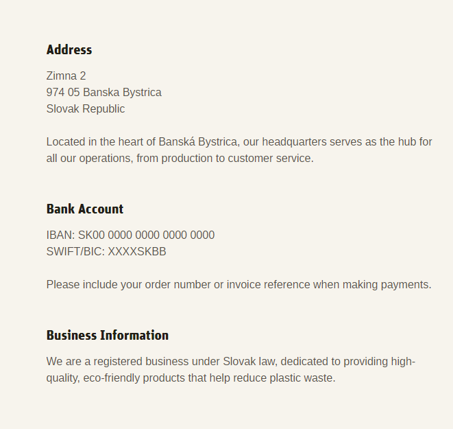
Within the Contact information the following fields are accesible:
Heading
- Enter a title for the contact information section. This heading will be displayed at the top of the section. For example, "Contact Information".
Content
Provide the main text content for the contact information section. This can include your store's address, phone number, email address, business hours, or any other relevant contact details.
Use the text editor tools to format the content, including bold, italic, links, bullet points, and numbered lists to enhance readability and emphasis.
Tip
You can use drag and drop to move individual blocks. In Shopify, individual blocks can be removed (bin) or hidden (eye), and then revealed again.