⭐ Sections
Collapsible content
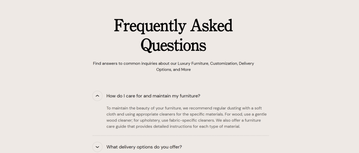
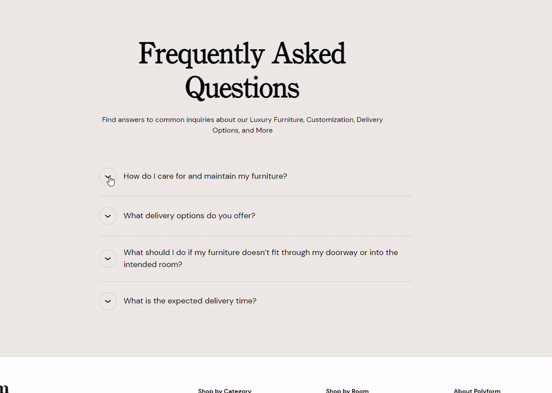
Enhance your store's user experience with our collapsible content feature. This section allows you to organize information efficiently, providing your customers with a clean and streamlined way to access additional details without overwhelming them. Ideal for FAQs, product details, or any content that needs to be easily accessible yet neatly tucked away. Improve your site navigation and keep your pages looking uncluttered and professional.
Adjust Collapsible content section
Within the Collapsible content settings, you can adjust the following fields:
Heading
- Set the main title for your FAQ or content section.
Lead paragraph
- Add an introductory paragraph that provides a brief overview or welcome message.
Heading and Subheading Text Alignment
- Adjust the alignment of your headings and subheadings:
- Left
- Center
- Right
Heading and Subheading Position
- Choose the position of your headings and subheadings:
- Top
- Left
Tip
In the mobile version the heading and subheading positions are always set to the top. This ensures a consistent layout and optimal readability for mobile users, regardless of the design settings applied to other device versions.
Button Style
- Select the style of the collapsible button:
- Arrow
- Plus/Minus
Button Position
- Decide where the button should be positioned:
- Left
- Right
Background Color
- Customize the background color to match your store's design.
Text Theme
- Select the theme for your text:
- Dark
- Light
Section padding
Top padding: Adjust the space above the section to ensure proper spacing and alignment with other elements on the page. This is measured in pixels (px).
Bottom padding: Adjust the space below the section for consistent spacing and design harmony. This is also measured in pixels (px).
Custom CSS
- Add custom CSS to further style and customize the newsletter signup section according to your specific design needs and preferences.
Available blocks
Within the Collapsible content, the following blocks are available:
Accordion
These customization options allow you to effectively present a specific product collection on your Shopify store, making it easy for customers to browse and discover products within that collection.
Question
- Enter the question that you want to address. This will be displayed as the clickable header for the accordion item.
Answer
- Provide a detailed answer to the question. This content will be revealed when the accordion item is expanded.
Accordion Collapse State
- Choose the default state of the accordion item (Closed or Open). This determines whether the answer is initially hidden or visible when the page loads.
Tip
You can use drag and drop to move individual blocks. In Shopify, individual blocks can be removed (bin) or hidden (eye), and then revealed again.