⭐ Sections
Before/After
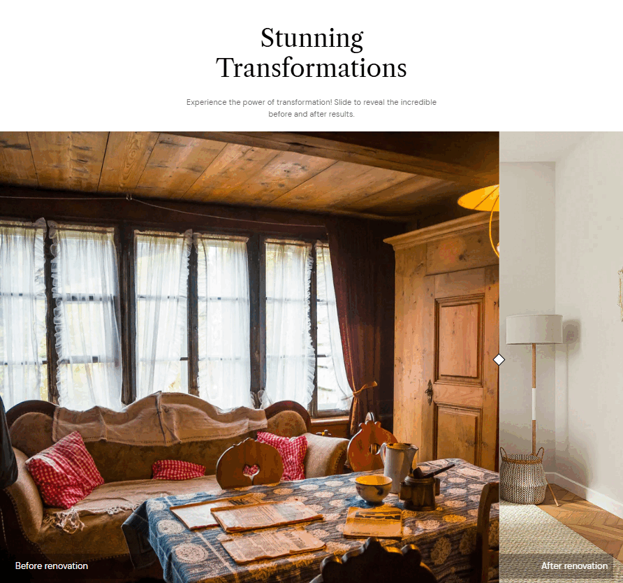
The Before/After section is designed to visually demonstrate transformations, improvements, or comparisons between two states. It allows users to interact with a slider to see changes side by side or stacked, making it an effective tool for showcasing product benefits, services, or processes.
Adjust Before/After section
Within the Before/After settings, you can adjust the following fields:
Text content
Heading – Enter a main title for the section, such as "See the Difference!" or "Before & After Transformation".
Subheading – Add a short descriptive phrase to give context to the transformation. Example: "Compare the results before and after using our product."
Description – Provide additional details explaining the transformation.
Before/After
Before Image – Upload or select an image that represents the "before" state.
Before Image Text – Add a short description to clarify what the "before" image represents.
After Image – Upload or select an image that represents the "after" state, showing the transformation or improvement.
After Image Text – Add a brief description explaining the changes in the "after" image.
Caption – A brief text displayed below the slider, giving more context to the comparison.
Slider Direction – Choose how the comparison slider moves:
- Horizontal – Users slide left and right.
- Vertical – Users slide up and down.
Slider Initial Position – Adjust the default position of the slider (e.g., 50% means it starts in the middle).
Slider Style – Choose the style of the handle that users move:
- Circle – A round slider handle.
- Square – A square slider handle.
Section Settings
Make Section Full Width – Toggle this option to stretch the Before/After section across the entire page width.
Desktop Content Alignment – Choose the alignment of text and images on desktop screens:
- Left – Content is aligned to the left.
- Center – Content is centered.
- Right – Content is aligned to the right.
Background Color – Set a background color for the section (e.g., white #FFFFFF or a custom color).
Text Theme – Choose between:
- Dark – Dark text for light backgrounds.
- Light – Light text for dark backgrounds.
Top Padding – Adjust the spacing above the section (measured in pixels).
Bottom Padding – Adjust the spacing below the section (measured in pixels).
Custom CSS
- Add custom CSS to further style and customize the newsletter signup section according to your specific design needs and preferences.
Tip
You can use drag and drop to move individual blocks. In Shopify, individual blocks can be removed (bin) or hidden (eye), and then revealed again.