Header and Footer
Header banner
A header banner serves as a prominent visual element at the top of the website, often used to display important announcements, promotions, or key information to visitors. It helps attract attention immediately upon landing on the store. The banner improves visibility of key content and enhances user engagement by encouraging clicks or directing customers to specific products or pages.
Adjust Header banner section
These blocks allow you to customize the header banner with various types of content, enhancing the functionality and appearance of your Shopify store.
Within the Header banner settings, you can adjust the following fields:
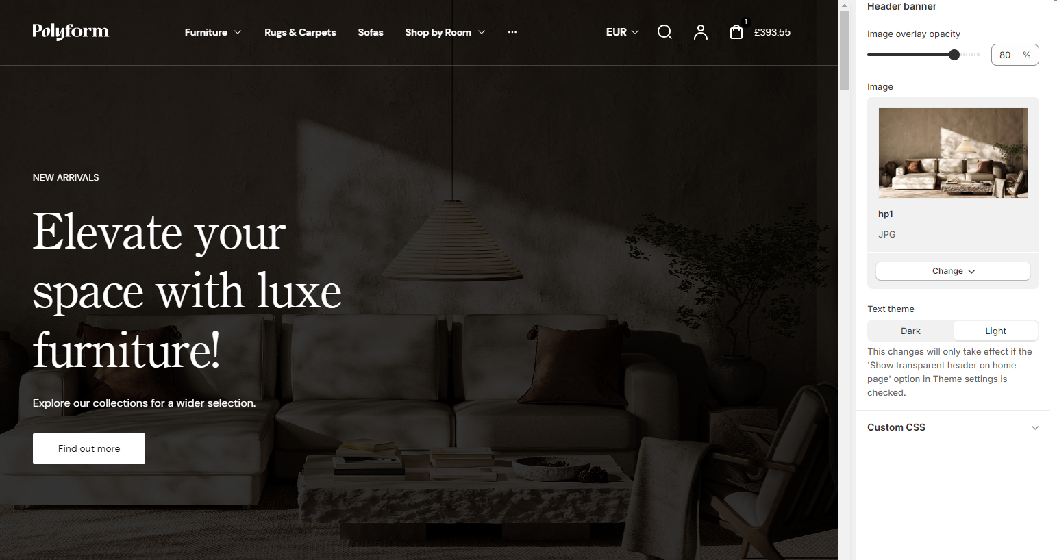
Image overlay opacity
- Adjusting this slider changes the opacity of the image overlay. Lower values make the overlay more transparent, while higher values make it more opaque. The specific percentage value can also be manually entered.
Example:
Image overlay opacity: 20 %
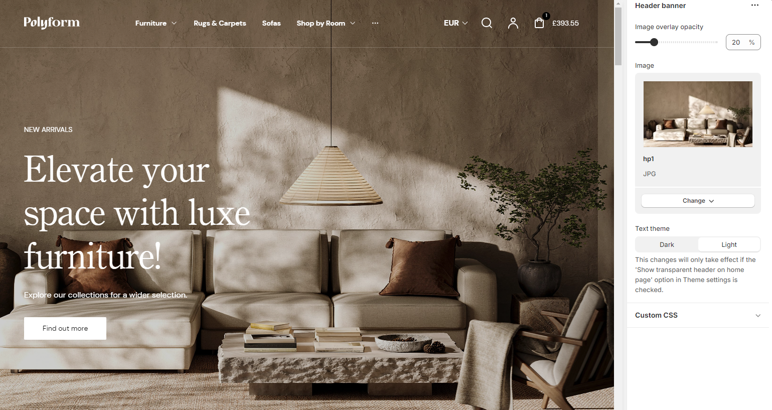
Image overlay opacity: 80 %
Image
Add background image for this section, use high resolution image for better user experience.
- Select image: Allows you to upload or select an image to be used in the header banner.
- Explore free images: Provides access to a library of free images that can be used for the header banner.
Mobile view options
These settings ensure the banner is mobile-friendly and adaptable to different display needs:
- Show banner content under the image on mobile: This option allows you to move the banner text below the image for better mobile viewing.
- Background color: You can set a background color for the banner content when it's displayed under the image.
Button
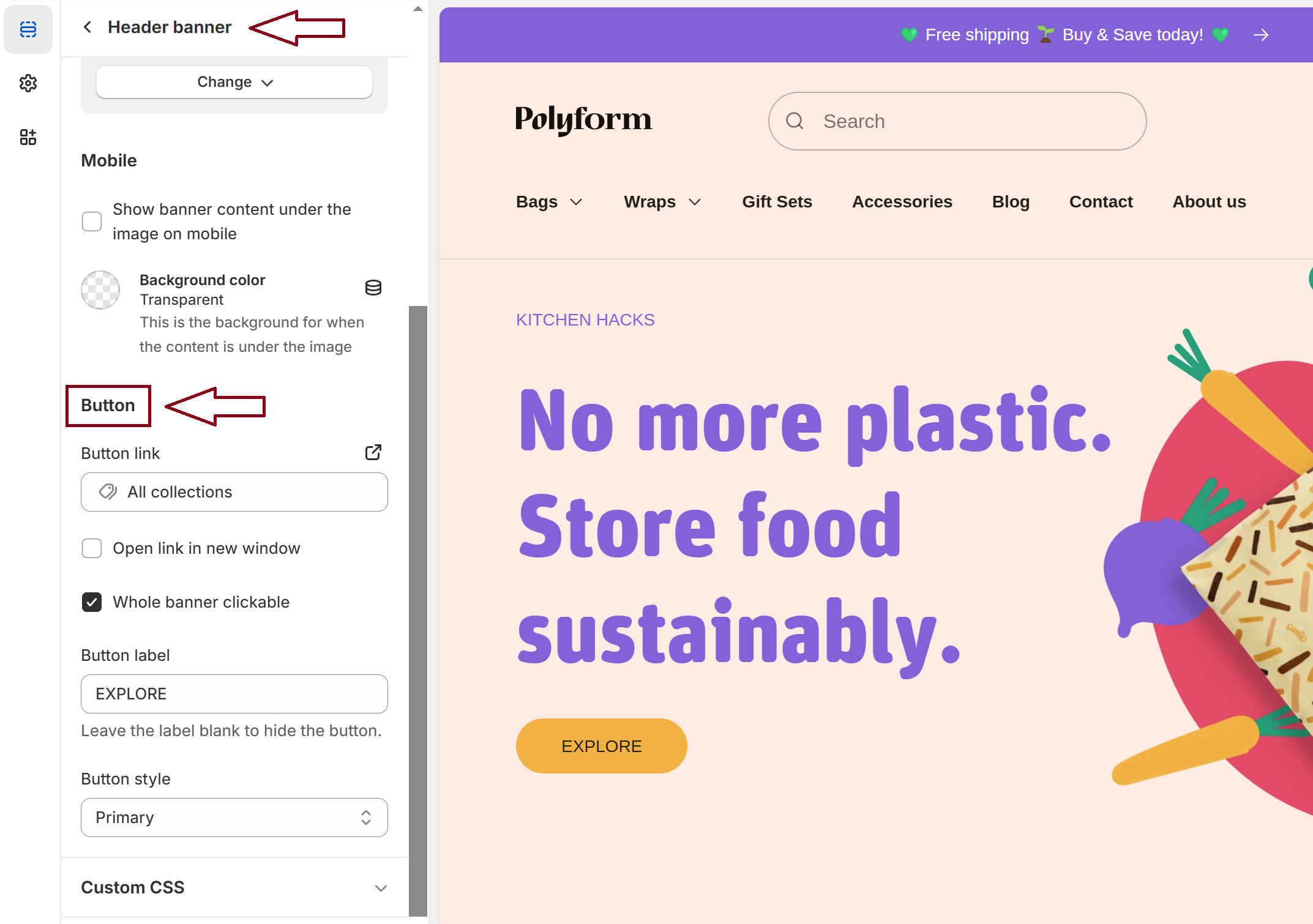
Button link
- Add a URL to define where the button will redirect users when clicked.
Open link in new window
- Enable this option to open the button link in a new browser tab or window.
Whole banner clickable
- Check this box to make the entire banner clickable, directing users to the button's link.
Button label
- Set the text displayed on the button. Leave the field blank if you want to hide the button.
Button style
- Choose the appearance of the button from the predefined styles (e.g., Primary, Default, Outline etc.).
Important!
Previously, this message was displayed in a separate block of the Header banner. Now, it’s integrated here for better visibility and consistency. Please adjust any references or usage accordingly.
Custom CSS
- Add custom CSS to further style and customize the benefits section according to your specific design needs and preferences.
Available blocks
Within the header banner, the following blocks are available:
Subheading
- Allows you to input the subheading text that will appear above the main heading, providing additional context or information.
- The Subheading color setting allows you to customize the color of the subheading text.
Heading
- Allows you to input the heading text that will appear below the subheading, providing main context or information.
- The Heading color setting allows you to customize the color of the heading text.
Content
- Input the body text, adjusts the size of the content text and provides formatting options such as bold, italic, lists, links, etc., to enhance the content's appearance.
- Text theme:
- Dark: Sets the content text on the header banner to a dark color.
- Light: Sets the content text on the header banner to a light color.
Tip
You can use drag and drop to move individual blocks. In Shopify, individual blocks can be removed (bin) or hidden (eye), and then revealed again.