Header and Footer
Header
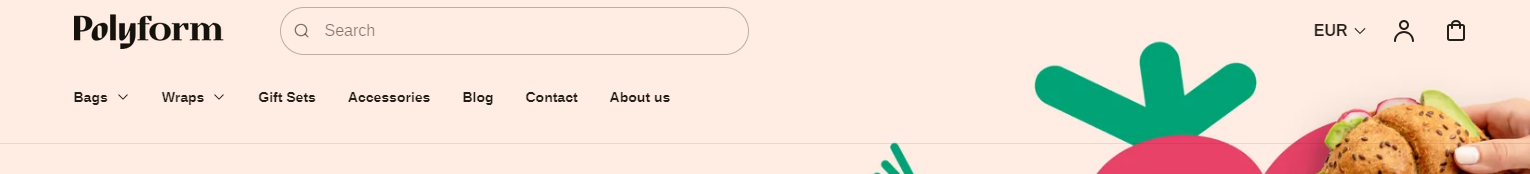
The header is the rectangular area that runs across the top of your store, featuring your logo, navigation, search bar, country selector, account and cart icon. It appears on every page to promote your company's brand and make it instantly recognizable to your visitors. The header is a static section and cannot be repositioned.

Adjust Header section
Within the Header settings, you can adjust the following fields:
Enable sticky header
- Checked: The header remains visible at the top of the screen as customers scroll down the page.
- Unchecked: The header will scroll out of view as customers scroll down the page.
Text theme
Controls the text color inside the header.
- Dark: The text will appear in a dark color (suitable for light backgrounds).
- Light: The text will appear in a light color (suitable for dark backgrounds).
Background color
Defines the background color of the header when the customer scrolls down the page.
- Transparent: the header background will remain see-through.
- A color is selected: The header will switch to that color during scrolling.
Desktop menu style
Complex: Uses a more detailed and possibly multi-level menu style for desktop views. Menu style is automatically optimized for mobile.
Simple: Uses a basic and straightforward menu style for desktop views. Menu style is automatically optimized for mobile.

Menu
The header often serves as a table of contents for the storefront, featuring key navigation links that you set up in the Navigation settings of the Shopify admin. To set a navigation menu on your header, you can link the navigation in this section.
- Change: Allows you to select which menu to display in the header. The current selection is the 'Main menu.' You can change this by clicking the "Change" button.
Tip
More information about configuring navigation on your online store can be found on Menus and links
Hide images in mobile menu
- Enabled: The mobile menu will be displayed without promotional or menu images. This option is useful if you want a cleaner, text-only navigation on smaller screens, making the menu simpler and faster to browse.
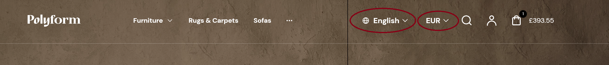
Language and Country selector
Under the Country/region selector, you are prompted to add a country or region by going to your payment settings. Afterwards, there are two options available:
Enable language selector – Allows users to choose their preferred language. This feature is ideal for multilingual sites, enhancing the experience for international users.
Enable country/region selector – Provides users with the ability to select their country or region, which can impact shipping and currency preferences.
Tip
For more header settings, see Header setting. To adjust your logo and favicon, visit Logo & Favicon settings
Available blocks
You can enhance the header's navigation by adding specialized mega menu blocks. Each block allows for unique layout and content, letting you showcase collections, products, or promotions inside your dropdown menus.
🧩 Mega menu with collections
Use this block to display curated collections directly in your navigation.

Settings include:
- Main menu position – Choose the order of the block within the dropdown menu (1–10).
- Layout – Define the structure:
- Navigation first – Navigation links appear on the left.
- Promo first – Collections appear on the left.
Navigation area:
- Navigation width – Set how much width (in %) the navigation section occupies (0%–100%).
- Number of columns – Divide links into 1–6 columns.
- Text alignment – Choose how navigation text is aligned.
- Hide submenu – Optionally hide the default submenu items.
Collection area:
- Collection width – Set how much width (in %) the collection section occupies (0%–100%).
- Number of columns – Choose how many columns the collection grid uses (2–6).
- Text alignment – Align text in the collection section.
- Collection blocks – Select up to 12 Shopify collections to showcase.
- Image type:
- Collection image – Show the collection’s featured image.
- Product image – Show the first product image from each collection.
- Image aspect ratio – Control image shape:
- Square (1:1)
- Portrait (2:3)
- Portrait (4:5)
- Landscape (3:2)
🧩 Mega menu with products
Highlight featured or bestselling products inside your dropdown.

Settings include:
- Main menu position – Choose the order of the block within the dropdown menu (1–10).
- Layout – Define the layout:
- Navigation first
- Promo first
Navigation area:
- Navigation width – Set width of the navigation section (0%–100%).
- Number of columns – Split navigation links into 1–6 columns.
- Text alignment – Align navigation text.
- Hide submenu – Optionally disable the default submenu.
Products area:
- Products width – Set width of the product section (0%–100%).
- Number of columns – Use 2–6 columns for product display.
- Text alignment – Align text within the product area.
- Image aspect ratio – Choose image shape:
- Square (1:1)
- Portrait (2:3)
- Portrait (4:5)
- Landscape (3:2)
- Products – Select up to 12 individual products to highlight.
🧩 Mega menu with custom promos
Use this block to insert custom content such as banners, campaigns, or announcements.

Settings include:
- Main menu position – Choose the block order in the dropdown (1–10).
- Layout – Define which section appears first:
- Navigation first
- Promo first
Navigation area:
- Navigation width – Set how much horizontal space the navigation links use (0%–100%).
- Number of columns – Organize navigation into 1–6 columns.
- Text alignment – Choose how text in the navigation area is aligned.
- Hide submenu – Disable the submenu if needed.
Promo area:
- Promo width – Define width for promo content (0%–100%).
- Number of columns – Choose how many columns the promos should span (2–6).
- Text alignment – Align the text inside promo blocks.
- Image aspect ratio – Control promo image shape:
- Square (1:1)
- Portrait (2:3)
- Portrait (4:5)
- Landscape (3:2)
Promo items (up to 6):
For each promo (1 to 6), configure:
- Image – Upload an image for the promo.
- Heading – Add a headline.
- Text – Add supporting or promotional text.
- Link – Assign a destination URL.
Tip
Each mega menu block is linked to one top-level navigation item. To configure multiple dropdowns, simply add more blocks.