General theme settings
Product card
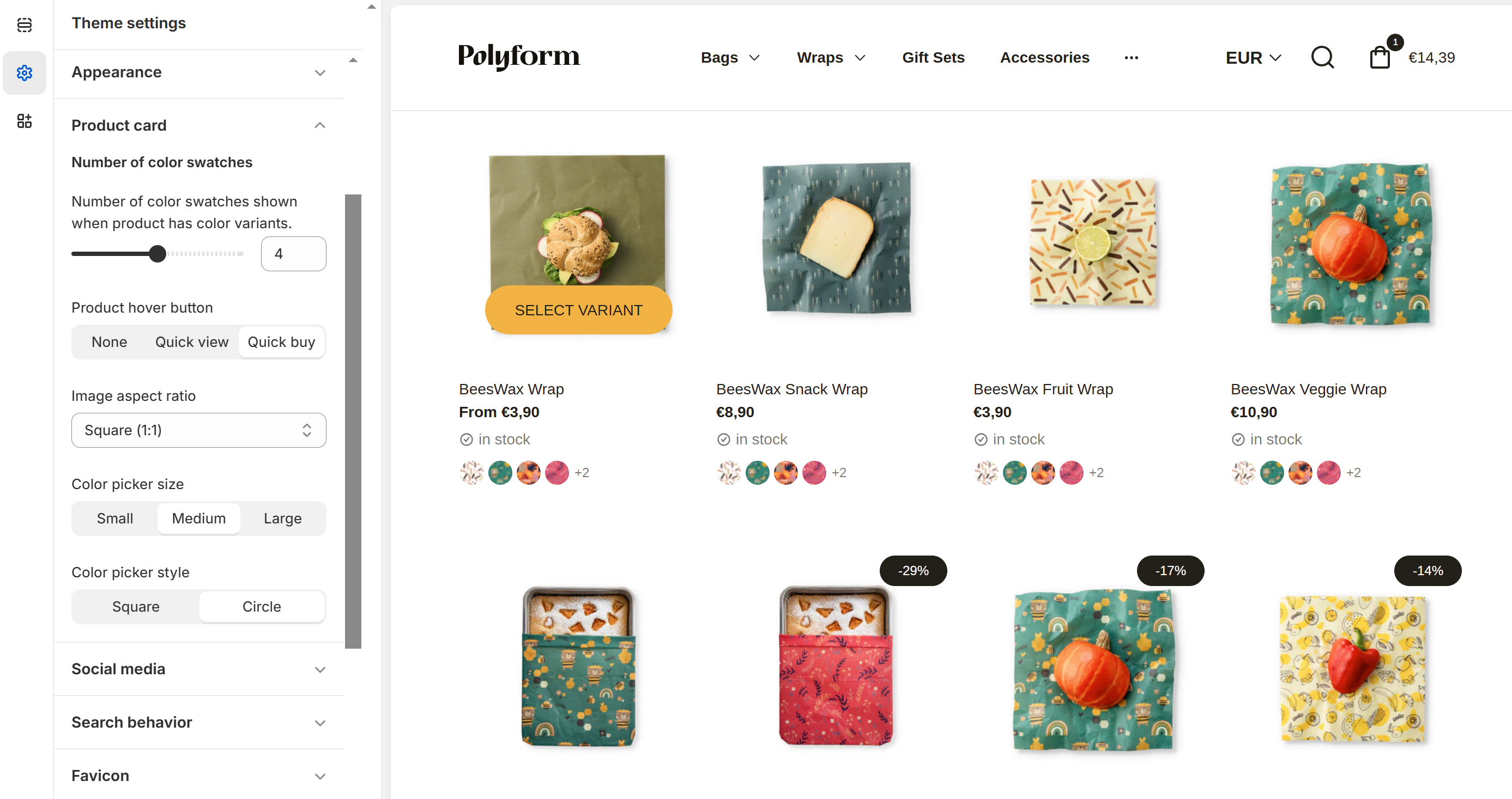
Configure the display of product cards on collection pages. Customize elements such as number of color swatches shown when product has color variants to create a compelling and informative product presentation or product hover button. .

Product Hover Button
This setting allows you to choose how customers interact with product images on your store, enhancing the shopping experience by providing convenient options to view or purchase products quickly.
None: No additional button will appear when a customer hovers over a product image.
Quick view: A "Quick view" button will appear when a customer hovers over a product image, allowing them to quickly preview product details without leaving the current page.
Quick buy: A "Quick buy" button will appear when a customer hovers over a product image, enabling them to add the product to their cart directly from the product listing.
Image Aspect Ratio
- Select the shape of the product image on the card (e.g., square 1:1, portrait 2:3 or 4:5, landscape 3:2) to match your store's design style.
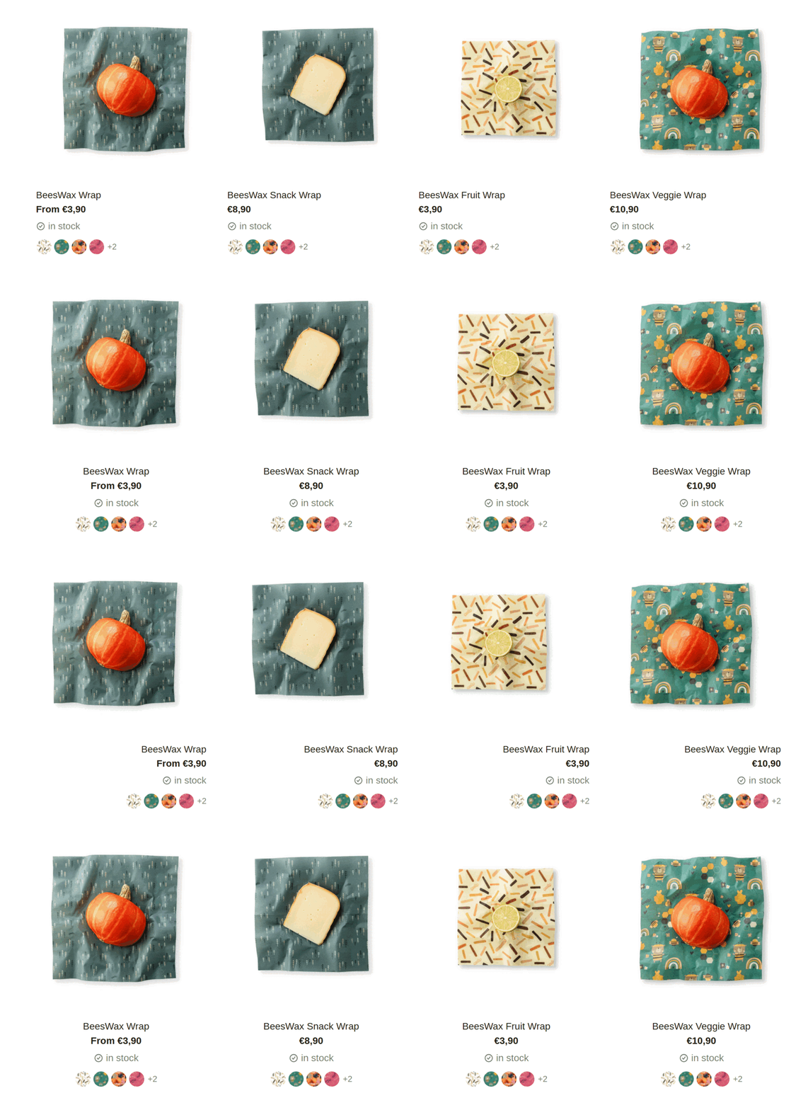
Content Alignment
Choose how to align your content within the product card for optimal presentation:
- Left-aligned: Aligns the content to the left side of the container.
- Center-aligned: Centers the content within the container.
- Right-aligned: Aligns the content to the right side of the container.

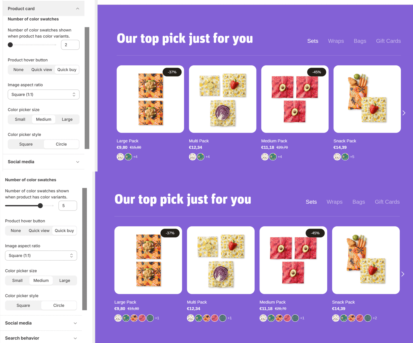
Number of Color Swatches
This customization helps customers quickly see the available color options for a product, enhancing their shopping experience and aiding in their decision-making process.
- Adjust the slider to set the number of color swatches displayed when a product has color variants. This setting allows you to choose how many different color options are shown to customers on the product card.
- When a product has more color variants than chosen, it will be shown as + number of variants

Color Picker Size
- Adjust the size of the color swatches displayed on the product card to small, medium, or large.
Color Picker Style
- Choose the style of the color swatches – either square or circle – to best fit your brand's look.