General theme settings
Colors
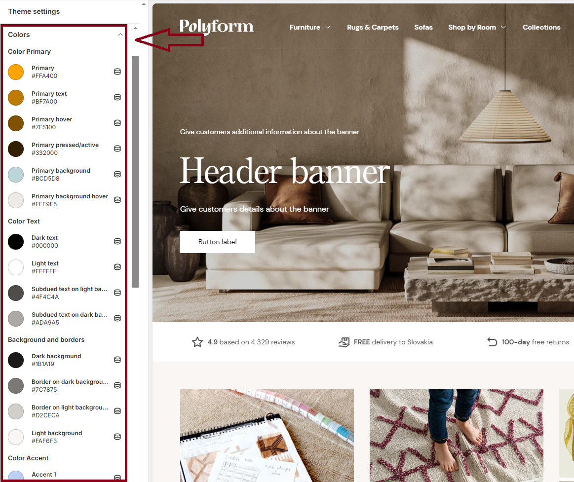
Set the color scheme for your entire store. Choose colors for various elements such as Color primary, Color text, Background and borders, Color accent, Feedback colors to ensure a consistent and visually appealing design.

| Text Name | Effect of Color Change |
|---|---|
| Color Primary | |
| Primary | Used for primary button background or link hover |
| Primary text | Used for links and similar elements |
| Primary hover | Used for primary button hover |
| Primary pressed/active | Used for primary button pressed/active state |
| Primary background | Used for outline button hover |
| Primary background hover | Used for menu hover background |
| Color Text | |
| Dark text | Used for most text |
| Light text | Used for most text |
| Subdued text on light background | Used for subdued text on light backgrounds |
| Subdued text on dark background | Used for subdued text on dark backgrounds |
| Background and Borders | |
| Dark background | Used for general backgrounds |
| Border on dark background | Used for borders on dark backgrounds |
| Light background | Used for borders |
| Border on light background | Used for general backgrounds |
| Color Accent | |
| Accent 1 | Used as an accent color |
| Accent 2 | Used as an accent color |
| Accent 3 | Used as an accent color |
| Accent 4 | Used as an accent color |
| Feedback Colors | |
| Positive | Used as a feedback color |
| Notice | Used as a feedback color |
| Warning | Used as a feedback color |
| Negative | Used as a feedback color |